| Bouchot navigation page, Preface, Chapter 1, Chapter 2, Chapter 4, Chapter 5, Chapter 6, Chapter 7, Chapter 8, Chapter 9, Index |
CHAPTER III.
 UR simple division into chapters will be understood without difficulty as not corresponding exactly with the most momentous epochs in the history of the Book in France and abroad. Doubtless it would be easy for France alone to find some limits and to furnish scholastic formulæ by which contemporary publishers might be grouped. But in order to present, as in a synoptical table, an essential and abridged sketch of the Book in all European countries, it appeared to us more
/ VENICE AND ALDUS MANUTIUS. p.99 /
convenient to begin with the confused and tangled notions by centuries and to unfold in our review the characteristic facts of each country conjointly. Moreover, after the sixteenth century neither Italy nor Germany could compare with France, which, less fortunate, perhaps, at the beginning than her neighbours, surpassed them in all the pride of her genius.
UR simple division into chapters will be understood without difficulty as not corresponding exactly with the most momentous epochs in the history of the Book in France and abroad. Doubtless it would be easy for France alone to find some limits and to furnish scholastic formulæ by which contemporary publishers might be grouped. But in order to present, as in a synoptical table, an essential and abridged sketch of the Book in all European countries, it appeared to us more
/ VENICE AND ALDUS MANUTIUS. p.99 /
convenient to begin with the confused and tangled notions by centuries and to unfold in our review the characteristic facts of each country conjointly. Moreover, after the sixteenth century neither Italy nor Germany could compare with France, which, less fortunate, perhaps, at the beginning than her neighbours, surpassed them in all the pride of her genius.The commencement of the sixteenth century found the French army in Italy, under the command of Louis XII. Marching from glory to glory, the French successively saw Pisa, Capua, and Naples, and that which has since been called the Renaissance displayed itself little by little to the conquerors. At Venice was living Aldus Pius Manutius, then the greatest printer of the entire world. Aldus was proprietor of the celebrated printing office of Nicholas Jenson, through his father-in-law, Andrea Torresani, of Asola, who acquired it on the death of the French printer ; and he had in a few years reached a position in which he was without a rival. We have seen that he composed, at the end of the fifteenth century, the admirable volume Hypnerotomachia, the renown of which became universal. Aldus was fifty-two years of age, having been born in 1447 ; and his learning was increased by daily intercourse with learned Italians, among them the celebrated Pico de la Mirandola. His establishment at Venice in 1488 had for its object the creation of a chair in Greek, in which language he was well instructed from his youth. Occupied with the idea of issuing editions of the principal Greek writers, which up to then remained in manuscript, he engaged himself in the formation of a printing office. He first / p.100 / published the Herone et Leandro of Musæus in 1494, quarto, in a Greek character apparently designed by him, and perhaps engraved by Francisco da Bologna ; then the Greek grammar of Constantine Lascaris, with the date of 1494 ; and the works of Aristotle in five folio volumes. At the time of the Italian wars Aldus was making a revolution in typography, by producing
 |
|
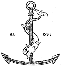
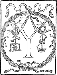
| Fig. 42.—The anchor and dolphin, mark of Aldus Manutius, after the original in the Terze Rime of 1502, where it appears for the first time. |
* Tory in his Champfleury explains thus the mark of Aldus and his / p.101 / device, which was in Greek the "Make haste slowly" of Boileau : "The anchor signifies tardiness, and the dolphin haste, which is to say that in his business he was moderate."
---------------------------
His marriage with the daughter of Andrea Torresani, of Asola, brought together into his possession two printing houses. The burden became too heavy for Manutius to think henceforth of publishing by himself. Besides, the wars did not allow him any repose, of which he bitterly complained in his prefaces. He attracted learned Greek scholars, who supervised, each one in his specialty, the works in progress, and founded a society, an Aldine academy, in which the greatest names of the epoch were united. Aldus conveys the perfect idea of a great printer of those times, doing honour to celebrated men, in spite of business preoccupations and of the annoyance caused by the war. It is said that Erasmus, passing through Venice, called on him, and not making himself known, was badly received by the powerful printer. All at once, at the name of the distinguished visitor, Aldus, overwhelmed for an instant, rose in great haste and showed him how highly he appreciated men of letters.
The war finished by ruining this state of affairs. In 1505 Aldus quitted Venice to travel, and on his return found it poorer than when he went away. Andrea d'Asola, his father-in-law, came to his aid ; but the great printer had received his death-blow ; and in spite of the activity which he brought to the new establishment, he further declined until 1515, when he expired, leaving an inextricable confusion to his son Paul.
He had early abandoned illustration for the scientific and useful in his publications ; besides, the size of book / p.102 / chosen by him did not admit of plates ; but other publishers employed artists in the ornamentation of the Book. Lucantonio Giunta, the most celebrated among them, was printer and engraver, a striking example of the affinity of the two trades from their origin. In 1508 Lucantonio Zonta, as he then spelt his name, published a Roman breviary in large quarto, with twelve
|
engravings in the Lombardo-Venetian manner, signed "L. A.," in very good style. The same artist-publisher cut a portrait of Virgil for an edition of that poet about 1515. Furthermore, Giunta did not alone illustrate the book from his own office. Other designers lent him their assistance. We find evidence of this in the Bible printed by him in 1519 in small octavo.
The most meritorious of the artists of Venice at this time was John Andrea, known as Guadagnino. He designed the vignettes for Florus's epitome of Livy, printed at Venice for Melchior Sessa and Peter of Ravenna (1520, folio) ; in 1516 he copied the plates of Dürer's Apocalypse for that of Alexander Paganini, of Venice. A Venetian work which signalised the beginning of the sixteenth century was the Trionfo di Fortuna
/ ITALIAN ILLUSTRATORS. p.103 /
of Sigismond Fanti, of Ferrara, printed by Agostino da Portese in 1527.
Venice was the home of Titian, and at the present time the great artist was at the height of his glory. In 1518 two brothers, Nicholas and Dominic dal Gesù, published a translation of the celebrated "Golden Legend" of Voragine. The plates which were added to the work were manifestly inspired by the school of the Venetian master. Unhappily the engravers have not always equalled the genius of the drawings.
To resume, the city of Venice was, at the beginning of the sixteenth century, one of the most prolific in publishers and artists of talent. Since the first establishments of the Germans, typography had successively employed in Venice Nicholas Jenson, a Frenchman, inventor of the Roman character ; Erhard Ratdolt, the first to employ illustration there ; and Aldus Manutius, scholar and printer, whose progress in printing elevated that art to the highest rank among human discoveries ; there were also remarkable engravers and draughtsmen, among others Guadagnino and Giunta, besides the anonymous masters of the school of Titian. The part of Venice in the movement, then, was great, but it may be explained by the riches of its citizens, the extent of its commerce, and the genius it possessed.
If we now return from Venice to the north, to Milan, the school of Leonardo da Vinci will make itself apparent in the Book. In order of date we will mention the Mysterii Gesta Beatæ Veronicæ Virginis, published by Gotardo de Ponte 1518, small quarto, with figures in the style of Luini, and Vitruvius in Italian by Cesariano. On the testimony of the author, the wood / p.104 / engravings in a book of Fra Luca Pacioli, De Divina Proportione, are attributed to Leonardo da Vinci. M. Delaborde does not believe this, but M. Passavant does.
In Germany, Nuremberg continued, with Albert Dürer and the artists of his school, to furnish book illustrations at the beginning of the century. The master reprinted his valuable engravings of the " Life of the Virgin" in 1511, and also the " Apocalypse." But
after him the art commenced to decline ; a hundred years later nothing remained of the honour and glory gained by Germany in the commencement. Among the most interesting of the Nuremberg publications is a chivalric poem by Melchior Pfinzfing, composed for the marriage of Maximilian and Mary of Burgundy. As M. Delaborde in his Débuts de l'Imprimerie well remarks, this is not a book destined for sale by a bookseller ; it is a work of art destined by an emperor for his friends, and he saw that it was an unapproachable work. / THE " THEUERDANCK" AND SCHÄUFELEIN. p.105 / Bold strokes, majestic letters, intertwined ornaments, are here multiplied. Three persons worked upon it for five years ; these were, Peutinger says, Hans Leonard Schäufelein, the painter, Jost Necker, the engraver, and Schönsperger, the printer of Augsburg, who quitted
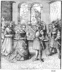
his native city for Nuremberg. When they were able to take a proof, craftsmen were unwilling to believe it to be a book composed in movable characters ; they were sure, on the contrary, that it was a true xylograph, cut in wood ; and, in fact, from the title here reproduced, / p.106 / the error was excusable. This work, which is now called the Theuerdanck, from the name of the hero of the romance, is ornamented with a number of wood engravings, numbered by Arabic figures. We reproduce one of the last plates, in which Theuerdanck—Maximilian—is introduced to the Queen—Mary of Burgundy. The designs of Schäufelein recall very nearly the work of Albert Dürer, his master ; but, as we said of him, these works, heavy and dull, although very clever, do not always suit as vignettes. Again, our criticism does not extend so much to the Theuerdanck, whose letters, excessively ornamented and much flattened, furnish a framework more suitable for the engravings than would a more slender character, which would be completely overshadowed by the German plate.
When we have mentioned the Passional Christi of Lucas Cranach, published by J. Grünenberg at Wittemberg in 1521—twenty-six mediocre wood engravings—we shall have cited the most important of the interesting and rare volumes published in Germany at the commencement of the sixteenth century.
The Netherlands, Spain, and England were working, but without great success. In the Low Countries Plantin and his gigantic enterprises may be recalled. In Spain the taste had not yet developed itself ; and although the drawing of illustrations may be careful enough, the wood-cutting is pitiable. We will mention the Seneca of Toledo in 1510, and the " Chronicle of Aragon" in 1523. Of England we will speak later.
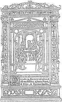
In France, on the contrary, we find an enormous commerce in books at the commencement of the sixteenth century. All the publishers mentioned in the / EARLY SIXTEENTH CENTURY FRENCH BOOKS. p.107 / preceding chapter were still living, and they were feeling the effects of the French conquests in Italy. The dithyrambic literature then inaugurated, and which had its origin under Louis XII., exercised a bad influence equally upon the printers and decorators of the Book. Doubtless the composition of the text and engravings was done hastily, for the great people did not like to wait for this kind of history. Le Vergier d'Honneur, written by Octavian de St. Gelais and Andry de la Vigne, was thus published about the end of the fifteenth century and ornamented with hasty vignettes, probably at the expense of Antoine Verard. Upon the accession to the throne of Louis XII., Claude de Seyssel, his master of council, composed Les Louenges du Roy Louis XII., and soon after translated it from Latin into French for the same Verard, who printed it in 1508.
The taste for historical works induced the publishers to produce La Mer des Histoires, which had already been published in the fifteenth century ; Thielman Kerver put forth the " Compendium" of Robert Gaguin in 1500 on account of Durand Gerlier and John Petit. The French version of this work was given in 1514 by Galliot du Pré, with vignettes, and afterwards under the name of Mirouer Historial, by Renaud Chaudière in 1520, by Nyverd, and others ; the same with the Rozier Historial, with figures, in 1522 and 1528. Among the most popular works was the Illustrations de la Gaule et Singularitez de Troye, by John le Maire de Belges, printed in Paris and ornamented. In 1512 it was published by Geoffroy de Marnef, in 1515 by John and Gilbert de Marnef, by Regnault, by Philip le Noir, and others, always in the Gothic characters / p.108 / which prevailed in France at the beginning of the sixteenth century.
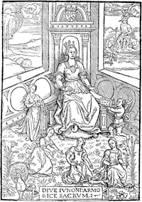
We give from the curious book of John le Maire an interesting woodcut representing Queen Anne of Brittany as Juno, in which we can without much difficulty see a remarkable sketch by a Bourdichon or a Perréal. The truly French style of this figure leaves no doubt as to its origin. At the same time, it may possibly have been inspired by the Virgin of a German master, say one of 1466, judging from the accessories, and even from the pose. This engraving will be found in the edition of 1512 of Gilbert de Marnef, in Gothic letter, quarto. On the reverse are the arms and device of John le Maire de Belges.
The time that elapsed from the death of Louis XI. until the accession of Francis I.—that it to say, from 1483 to 1515—was, to employ an old expression, the golden age of French printing and illustration. Under Charles VIII. and Louis XII. the designers on wood were not yet affected by the neighbouring schools ; neither the accentuated Italian influence nor the German processes had reached them ; they did in their own way that which came to them, and they did it in their own fashion and habit, without foreign influence. Further, the kings did not ignore them, and Louis XII. preserved to the printers of the university all their rights and privileges in a magniloquent ordinance, in which the art of typography was extolled in the highest terms. It restores to them all the advantages that they had lost. It recites, " In consideration of the great benefit that has come to our kingdom by means of the art and science of printing,
the invention of which seems more Divine than human, which, thanks to God, has been invented and found in our time by the help and industry of booksellers, by which our holy Catholic faith has been greatly augmented and strengthened, justice better understood and administered, and Divine service more honourably and diligently made, said, and celebrated, . . . by means of which our kingdom precedes all others," etc., etc., (Blois, 9th April, 1513). Certainly Louis made the best of himself and his kingdom in this preamble, but it must be recognised that France already held a predominant rank in the new industry, and that beyond the Italians she had no fear of serious rivalry. The school of ornamentists made constant progress. Before the books of hours, the booksellers contented themselves with miserable blocks, placed side by side, forming a framework of good and bad together ; but after Simon Vostre, Verard, and the others they were singularly refined. The borders, at least in the books of hours, had become the principal part of the book ; they had in them flowers, architectural, complicated, and simple subjects, all of perfect taste and extreme elegance ; and, as we have observed in the representation of Anne of Brittany in the Illustrations de la Gaule, the figure subjects were no longer mechanical, commonplace, and tiresome blocks, but, on the contrary, more often works specially designed and engraved by artists of merit.
Geoffroy Tory, born at Bourges in 1480, continued after Vostre and Verard the onward march of illustration of the Book. He was a sort of encyclopædist, who knew and foresaw everything, but with a singu-
larly subtler and finer genius than his predecessors. There is now very little doubt that at first Tory was / p.112 / an engraver and printer. Moreover, he published with Jean Petit one of his first volumes, the geography of Pomponius Mela, printed by Gilles de Gourmont in 1507. Tory was then an erudite and diffusive commentator. Later he published a book with poor engravings (Valerii Probi Grammatici Opusculum, 1510), waiting until his good star should place him on the right road. He had for his mark, say the bibliographers, the cross of Lorraine (
If M. A. Bernard*
* Geoffroy Tory, Peintre et Graveur, Premier Imprimeur Royal, Réformateur de l'Orthographe et de la Typographie : Paris, 1857, 8vo.
---------------------------
may be credited, Geoffroy Tory cultivated all the sciences with equal success. For our purpose, suffice it to recognise his right to one of the first places in the art of decoration of books of hours. Doubtless his travels in Italy had contributed to modify his taste and to detach him a little from the sober and simple manner that then characterised French engraving ; but he nevertheless preserved the indelible traces of the origin of his art, in the same way as some people cannot correct their provincial accent. The Heures de la Vierge, which he designed, and which
he had engraved about 1520, on account of Simon de Colines, is marvellously surrounded by ornaments, until then unknown in France ; at the same time,
and in spite of other tendencies, it is purely a French work, and the specimen given here is a convincing proof.
Geoffroy Tory composed a curious book, as poetic as learned, in which he studied at once the form of the letter from the typographic and the emblematic point of view, and also the French orthography of the time. He tells us himself that he was brought to commence this book on the fête-day of the kings, 1523, when, after a frugal repast, he was, he says, " dreaming on my bed and revolving my memory, thinking of a thousand little fancies, serious and mirthful, among which I thought of some antique letters that I had made for Monseigneur the treasurer for war, Master Jehan Grolier, councillor and secretary of our lord the King, amateur of fine letters and of all learned personages." Tory called his book Champfleury, auquel est contenu l'art et science de la deue proportion des lettres . . . selon le corps et le visage humain, and he published it himself in small folio, putting upon it the sign of Gilles de Gourmont, in 1529.
At heart Tory had been fascinated by the theories of Dürer on the proportions of the human body ; and he says, " The noble German painter Albert Dürer is greatly to be praised that he has so well brought to light his art of painting in designing geometrical forms, the ramparts of war, and the proportions of the human body." He wished to indicate the true measure of letters to his contemporaries, " the number of points and turns of the compass that each one requires." The most amusing part of this curious treatise is his short academical preface, where, under a playful form, the great publisher studies the orthography of his time, and exclaims against the forgers of new words, the Latinisers of the language, " the skimmers of Latin,
/ GEOFFROY TORY'S " CHAMPFLEURY." p.117 /
jesters and gibberers, . . . who mock not only their shadows, but themselves." The entire passage was copied by Rabelais, nearly literally, and it indicates that its author was possessed of good sense, which unhappily, all his contemporaries were not.
For the technical part, he added to his theories a
 |
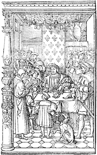
With the importance that cannot be denied to his / p.118 / works, Geoffroy Tory founded a school ; and it was from his workshop that the plates came for the book of Paulus Jovius on the dukes of Milan, published by Robert Estienne in 1549, quarto. The portraits of the dukes in this work have been attributed to Tory himself, but he died in 1533, and there is not the least indication that he engraved these sixteen portraits with his own hand sixteen years before their publication. Besides, our doubts as to the cross of Lorraine being the exclusive signature of Tory, as has been believed, lead us to think it the collective mark of a workshop, as we meet it on works long after the death of the master. As a proof, the mark is found on the engravings of L'Entrée du Roi à Paris in 1549, which cannot be taken as a posthumous work of Tory, for these engravings had their origin at a certain and special date. But in spite of the absence of the monogram, the admirable block from the Diodorus Siculus of Antoine Macault might, from its design and engraving, be considered as by Tory himself. Holbein, who, about the same time, designed a somewhat similar scene, the King of France seated on a throne receiving poison from the hands of Death, never did anything better. Within the scanty proportions of the design, all the figures are portraits. Duprat, Montmorency and the three sons of the King may be recognised ; Macault, on the left, is reading his translation to a circle of nobles and men of letters. This admirable page is one of the truest and most skilful of the monuments of French engraving ; it is equal to the best inventions of Holbein, and it marks the culminating point of the illustration of the Book before the exaggerations of the
school of Fontainebleau. Geoffroy Tory was not the publisher. The Diodorus Siculus, doubtless prepared two or three years before, was not published until 1535, in quarto, with his ordinary mark of the " Pot Cassé."
We have now arrived through him at the reign of Francis I., who was called the father of letters, and who for various reasons favoured the arts. Doubtless grand paintings and the decoration of the royal palaces interested him more than vignettes in books and the efforts of printers ; but, at the same time, books occupied him. He studied much, and in his travels accumulated many volumes. An account in the French National Archives shows that Claude Chappuis, his librarian, packed entire cases, which were sent to Dauphiné at the time of the wars of Piedmont, the carriage costing twenty livres tournois. Francis had, moreover, following sudden impulses, curious fits of wantonness and mischief. It was perceived a little later that the doctrines of Luther were propagated by the Book ; and the Sorbonne was up in arms, on the pretence of imposing its own expurgated text of the Bible on the publishers and tolerating no other. Theodore Beza, enemy of the Sorbonnists, said with regard to this (we translate the antique French literally), " Our great doctors with cherubic visage have forbidden men to see the Holy Bible in vulgar language, of which every one has knowledge, because, they say, the desire of knowing everything engenders nothing but error, fear, and care. Arguo sic, if they so, for its abuse, wish to take away this book, it is clear also that it is their duty to put away the wine with which each of them makes himself drunk."
This piece is only cited to show to what lengths matters had gone, thanks to printing. It is very certain that all the pamphlets, placards, and other horrors published to raise religious warfare, did not aid in the progress of the Book. The King was not always disinterested on the technical question ; books merited encouragement, at least as much as castigation, and besides, as time passed, they gradually transformed men and ideas. In spite of apparent severities, was not the King himself a little touched by contact
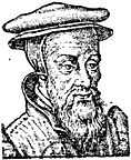 | |
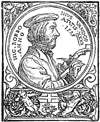
Fig. 53.—Robert Estienne, after the engraving in the Chronologie Collée. |
Robert Estienne married the daughter of Josse Badius, of Asch—Badius Ascencianus, one of the first Parisian typographers of the time. We reproduce the mark of
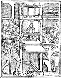 Fig. 54.—Printing office of Josse Badius at the commencement of the sixteenth century. |
Robert Estienne does not appear to have concerned himself much about the decoration of the Book. The purity of the text and the characters were essentials with him, erudition, and not art. He published many works in Latin and Greek, among them the Thesaurus, a great Latin dictionary published in 1532, also a Bible, with notes by Vatable, revised by Leon de Juda. From that came trouble. Leon de Juda was a partisan of Zwingli ; the Sorbonne accused the Bible of leaning / SIXTEENTH CENTURY ILLUSTRATION. p.123 / towards the Huguenots ; Francis I. took the part of Estienne, but when that prince died Estienne fled to Geneva, where he was accused of having imported the royal types. The truth was that he simply imported the matrices.
At this time everything served for the decoration of
 | |
|
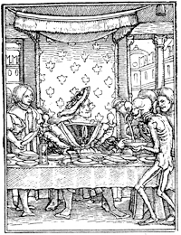
Without entering into detail, something must be said of Lyons, then a most extensive and prosperous centre of bookselling. Lyons had the signal honour of publishing first in France the celebrated cuts of the "Dance
|
With Holbein, as with Geoffroy Tory, we arrive at the / THE SCHOOL OF BASLE. p.125 / zenith of illustration and marvellous skill of the engraver. If we were to institute comparisons, it was Hans Lutzelburger who cut the blocks after the designs of the Basle master, but, contrary to what generally happens, the translator reaches almost to the height of his model ; the line is perfection itself, it is precise and intelligent, simple, and, above all, explicit. If the work of Lutzelburger be admitted, it must also be admitted that Holbein designed his cuts before 1526, date of the death of the Basle engraver ; but it was precisely before 1526 that Holbein lived in Basle, and it was after he had travelled. We will add nothing to the universal praise of the book of Treschel, of Lyons ; everything has been written of Holbein, and repetitions are unnecessary. We would ask the reader to compare the Francis I. of Tory and the King in Holbein's " Dance of Death ;" there is a certain family resemblance between the two cuts, which is a singular honour for Tory.
At the commencement of the century Basle had a school of Formschneiders working for export. Besides the numerous products used at Lyons, it had also a trade in wood blocks, which, having been used, were afterwards sold. Among these exchanges of engravings were many plates of Brandt's " Ship of Fools," sold in 1520 to Galliot du Pré, publisher, of Paris, who used them in the Eloge de la Folie of Erasmus.
The reign of Francis I. saw a great advance in the national art of illustration. The arrival at the court of Italian artists of the decadence, such as Rosso and Primaticcio, produced a revolution in taste. The exaggerated slightness of the figures brought by these artists from beyond the Alps was considered as of supreme dis- / p.126 / tinction ; in their twisted draperies and mannered poses was seen a precious beauty that tempted the ready intelligence of the court of France. The simple and ingenuous figures of the old French artists were ranked among the refuse of another age, and their compositions were regarded with contempt, and deemed antique.
The rage for emblems and for allegories and mythological figures generally was well suited to these eccentric and bizarre inventions. From another side, an entire class of artists or artisans, book illustrators first, then enamellers and jewellers, made use of these Italian models, with which the King encumbered his galleries, and which, at great expense, covered the walls of Fontainebleau. One can understand what these skilful men made of such a movement and of so thoughtless an infatuation. The publishers saw the demand, and composed works of which the sale was assured by the subjects that they furnished to other designers. This explains the quantity of Alciati's " Emblems" and Ovid's " Metamorphoses" published at Lyons and Paris, and copied and recopied a hundred times by the art industries of the time. Without it the enormous success of mediocre productions, as the " Emblems," for example, in which the meaning of the enigma or rebus cannot always be seized, is ill understood. It was Alciati who made this literature the fashion. He was a sort of Epicurean and miserly jurisconsult, who had as many lords and masters on earth, as the kings and princes who liked to bid against each other to engage him. He had quitted Italy, seduced by the offers of Francis I., but when Sforza paid him a larger sum, he returned, giving as reason for his vacillation that the
sun had to travel the earth and warm it by its rays ; this was an emblematic answer, for his emblems had all the coarse, sceptical humour which not a few had then already discovered. At most these philosophical aphorisms, if we take them seriously, have their droll side in that their author often practised the reverse of his teaching. A miser, he abuses the avaricious ; flying his country for the love of gain, he blames those to whom " a better condition is offered by strangers." Yet he is sometimes logical and consistent, as when he assures us that " poverty hinders the success of intelligence," and when, finally, lover of good cheer, he died of indigestion in 1550.
His book of " Emblems" had a vogue that lasted until the seventeenth century, and repetitions were infinitely multiplied : at Paris by Wechel in 1534 ; at Lyons by Hans de Tornes, of Suabia, one of the greatest Lyons publishers ; by Roville, also one of the first Lyons publishers, and by Bonhomme ; at Venice by the Alduses ; in fact, everywhere, translated into French, Spanish, and Italian.
Bernard Salomon, called le Petit Bernard, born at Lyons, was one of the designers of the school of Fontainebleau—that is to say, of the Franco-Italian school of which we have spoken above—who furnished many of the engravings for books printed at Lyons. He illustrated the edition of Alciati's " Emblems" published by Bonhomme in 1560 ; and designed skilful little plates, which, with the text, were surrounded by a border from the workshop of Geoffroy Tory, for Ovid's " Metamorphoses," published by Hans de Tornes in 1564. Bernard had all the defects and all the
/ CORNELIS DE LA HAYE. p.129 /
qualities of those of his time, from John Cousin to the least of them ; he was a Primaticcio on a small scale,
but agreeably so. His designs for the New Testament were also very careful, but in them more than else-
where the manner and the affectation of the school of Fontainebleau are apparent.
The workshops of the second city of France, we see, / p.130 / had at this time attained considerable importance ; but before the books of which we shall speak, Roville published two anonymous books, one L'Entrée du Roi Henri II. à Lyon, in 1549, ornamented with very graceful woodcuts, the other the Promptuaire des Médailles, comprising a series of charming portraits under the pretence of reproductions from the antique. The designs of the Entrée are often attributed to John Cousin, as it is a rule with certain amateurs to give a known name to a work ; but it must be remembered that Lyons then had celebrated artists, Petit-Bernard, alluded to above, and Cornelis de la Haye, of whom we have more to say ; and it is not necessary to go to Paris or to Rome to find the author of these illustrations.
Cornelis de la Haye was a painter who executed nearly the same work as Francis Clouet in Paris, portraits on panel, in a clear and harmonious tone, then much the fashion. During a journey of the King, he had, if Brantôme may be credited, portrayed the entire court, keeping the sketches for himself. Ten or fifteen years after, Catherine de Medicis, passing through Lyons, saw these portraits and highly praised them, recognising the old costumes, astonished at the courtiers of the day, whom she had never seen in such dress. This artist is now known, thanks to various works that have been found, among others two portraits of the sons of Francis I., preserved by Gaignières, who attributed them resolutely to Cornelis, doubtless on the faith of inscriptions that have disappeared. Both of them were engraved on wood at Lyons and published in Roville's book the Promptuaire / THE " PROMPTUAIRE DES MÉDAILLES." p.131 / des Médailles, mentioned above, with small differences of detail altogether insignificant. It is not impossible then that Cornelis designed these portraits, and that they were drawn on wood after the cabinet models
spoken of by Brantôme. The delicate figures of the Promptuaire are the work of a master ; and the differences mentioned are those of the artist, not of the copyist, who would not be permitted to change anything. It is the first time, we believe, that these com- / p.132 / parisons have been made ; they will perhaps help the learned Lyonnais to pierce the mystery, but in any case our suppositions are more honourable to Cornelis de la Haye than the fancies of Robert Dumesnil (Peintre-graveur Français, tome vi., p. 343). To judge by the four little medallions here reproduced, the art of engraving on wood was rarely more skilful than in these portraits. It would not be astonishing if a man like Cornelis had designed the figures of the Entrée de Henri II. In any case, why should we choose John Cousin instead of Petit-Bernard ? At this time, we know, the kings carried in their suite their ordinary painters ; but we do not know that John Cousin followed the court to Lyons in 1549. He did not hold an official position, like Clouet.
This artist produced well-authenticated works ; one of them is signed, and leaves no doubt : the Livre de Perspective de Jehan Cousin Senonois, Maistre Painctre, published in 1560 by Jean le Royer, printer to the King for mathematics. This profession of printer for mathematics had its difficulties of engraving, for Le Royer tells us in his preface that he had himself finished the plates commenced by Albin Olivier. In another practical treatise, entitled Livre de Portraiture, published in 1593, John Cousin is styled peintre géometrien. It is beyond doubt that this master produced for many works figures and ornaments, but what were the books ? The manner was then to repeat the engraved borders of titles, the passe-partout, in the centre of which the text was printed. Cousin designed many of these title-pages on wood ; that of the Livre de Portraiture affords a curious element / ENGRAVED TITLE-PAGES. p.133 / of comparison ; but he was not by any means the in-
ventor. In 1555 was sold at Antwerp a book printed from engraved plates after John Vriedman, by Gerard / p.134 / Juif, which is simply a collection of engravings for title-pages for the use of publishers.
It is about this time that metal plates may be seen in conjunction with wood engraving in the illustration of the Book, and the best artists attached their names to important publications of this kind. We have explained in a former chapter in what this process is least convenient in the impression of a book. In fact, two successive printings, that of the plates and that of the text, were additional trouble and a frequent cause of errors ; but wood-cutting was somewhat abandoned in the middle of the sixteenth century, especially for separate plates, and engraved plates took a considerable importance under different artistic influences. The first was the facility of engraving a metal plate compared to the difficulty of cutting a wood block. It thus naturally happened that the artists of the burin wished to employ their art in illustration, and taste was soon drawn to the new process.
In France the first volume of this kind was printed in 1488 by Topie de Pymont in folio : the Pérégrinations en Terre Sainte of Bernard de Breydenbach, with figures on engraved plates copied from the Mayence edition of 1486. Since this manner was abandoned until about 1550, as much for the reasons given above as for others, we only meet with a stray plate now and again, which remains as a bait, and relates to nothing. Under the reign of Henri II. the smallness of the volumes did not always admit of wood engravings, and the artists in metal found a footing among illustrators ; they made attempts, such as that of the Histoire de Jason of Réné Boivin in 1563, which came out under / P. WOÉRIOT—BOOKS WITH PLATES. p.135 / Charles IX. in a charming volume of engraved plates by P. Woériot.
The " Emblems" of Georgette de Montenay were also in the burlesque style of Alciati, but they had an advantage, as the author assures us :—
|
" Alciat fist des emblèmes exquis, Lesquels, voyant de plusieurs requis, Désir me prist de commencer les miens, Lesquels je croy estre premiers chrestiens." |
By the privilege dated 1566, five years before publication, we see that it is permitted to Peter Woériot, engraver of the Duke of Lorraine, to portray, engrave, and cut in copper the said figures called emblems for the time and term of five years (18th October, 1566). Peter Woériot sometimes signed his prints with the small Lorraine cross adopted by Geoffroy Tory's workshop, as may be seen in our engraving.
Copper plate engraving had by this time established itself, and the works that were so illustrated spread themselves. Du Cerceau published his admirable collection of Plus Beaux Bastiments de France in folio 1576-79, which had numerous plans and views of the royal and princely castles. Thevet put forth his Cosmographie Universelle and his Hommes Illustres, the latter adorned with skilfully engraved portraits. In Paris the publishers Mamert Patisson, who married the / p.136 / widow of Robert Estienne and took his mark, Adrien le Roy, and Robert Ballard, published the celebrated Ballet Comique de la Royne Faict aux Nopces de Monsieur le Duc de Joyeuse, composed by Balthasar de Beaujoyeux, valet de chambre to Henri III. ; and in this book, in
which were put hasty etchings, the King displayed all his immodesty and depravity. The Book has often had the unconscious mission of transmitting to posterity the unworthiness of its author or of its heroes. From this time the Book has left its golden age to enter into the boastings of courtiers and political abstractions.
Among the publications opposed to the Government of the time, the two associates James Tortorel and John Perrissin, of Lyons, had published a celebrated collection of plates on the religious wars that stained the reign of Charles IX. with blood. At first engraved on metal, these plates were worn out, and were gradually replaced by others engraved on wood, on which several artists worked, among them James le Challeux and also John de Gourmont, one of the most celebrated wood-cutters of the sixteenth century. This was a work composed of single leaves in folio size, which had an extraordinary sale among the religious people of the time.
At the same time, illustration on wood did not stand still. The portraits of authors diffused by the pencil of Clouet and his school were commonly put at the head of their works. We cannot say whether Clouet himself designed the portraits of Tiraqueau and of Taillemont in 1553 ; of Du Billon, the author of the Fort Inexpugnable, in 1555 ; Papon and Ambroise Paré in 1561 ; Grevin, Ramus, and others ; but the precision of these physiognomies recalls the peculiar manner of the French artists of the sixteenth century. The " Poems" of Ronsard in 1586 contains a series of very clever portraits, among them that of Muret, his commentator, one of the most perfect of its kind. Christopher de Savigny, author of the Tableaux Accomplis de Tous les Arts Liberaux, published by John and Francis de Gourmont in 1587, is represented at full length in the frontispiece of his work, offering the book to the Duc de Nevers, to whom it is dedicated. This plate in folio, probably engraved by John de Gourmont, is the best finished that / p.138 / we have seen. The work of Savigny, forgotten as it may be now, had a great reputation in its own time ; and Bacon took from it the idea of his " Advancement of Learning."
Speaking of the Duc de Nevers, it will not be without interest to our readers to mention here a manuscript found by us in the Bibliothèque Nationale, which enables us to give an account of the work then necessary for the publication of an illustrated book. In 1577 the Duke arranged for the impression of an apologetic book, of which no trace remains ; and his intendant writes a long letter to him on the subject of composition and bindings. It was necessary that the work should be produced quickly, bound and gilt, for presents. The intendant thinks calf will be the most expeditious covering. " It would be much the best to use black or red calf, . . . well gilt above, and not vellum, which is a thin parchment that quickly shrinks." The statements of this man of business show that five proofs of each sheet were taken for typographical correction, and that twelve full days were wanted for the binding. The most interesting part of this memoir is that which treats of the engraving on wood of the portrait. The plate was designed by an artist who had afterwards gone away ; it was not satisfactory, but the ornaments would pass. The intendant proposes to " fix a little piece of wood in the block that could be drawn upon." Here we see correction by elimination. The pear-wood on which the original figure was engraved was to be cut out, and a square of boxwood substituted, " forasmuch as in this task the pear-wood, which is the successful, well-cut block, is the wood that is harder."
/ ILLUSTRATION IN 1577. p.139 /
The portrait of the Duchesse de Nevers was better, yet the pear-wood had given way under the work. " That
of Madame is more passable. Nevertheless, there is still something to say to one eye. The wood cannot carry the / p.140 / subtlety of the line." Here, in a few clear and explicit lines by a man of the time, we see the economy of a publication of the sixteenth century, at a time when wood engraving was declining, to give place to engraving on metal, which was soon to reign supreme, through the most important book house of the century : the Plantins of Antwerp.
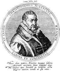
Christopher Plantin, like Jenson, came originally from Tours. After having learned his art with Macé at Caen, he went to Paris, from which the wars soon drove him. He left for the Low Countries, and there Philip II. nominated him as chief printer — "architypographus." Established at Antwerp in 1555, he surrounded himself, as had the Estiennes and Alduses, with most of the learned and literary men of his time, among them Justus Lipsius, to whom Balzac attributed the Latin prefaces signed by Plantin. It is certain that he was neither an Estienne nor an Aldus. His artistic probity caused him to submit the proofs of his works to strangers, with promise of recompense for faults indicated ; the Estiennes employed the same system. Plantin, not to be behind any of his contemporaries in typographical perfection, brought from France the celebrated type-founder William Lebé, and charged him to furnish a special fount.*
* In the Bibliothèque Nationale is a copy of an octavo Album de Caractères, in which Lebé has written, " This gloss, made in Paris (1574) by me, is my fourteenth letter, and the text is made on the pattern of the preceding one for size, but of a better art ; and from this was printed the great Bible of Antwerp by Plantin, to whom I sold a fount " (folio 6). On folio 20 he wrote, " I do not know whence came this small Hebrew that I received from Plantin to make a smaller one for him. He sent me this half-sheet, and I have not seen at Venice another part."
---------------------------
Under the orders of / CHRISTOPHER PLANTIN. p.141 / Philip II., he printed the celebrated Polyglot Bible, in eight folio volumes, absolutely perfect in its execution ; unfortunately the Spanish Government, having advanced funds in the course of publication, prosecuted him with the utmost rigour to obtain repayment. This very nearly shut up his printing house, but he took
|
Plantin died at the age of seventy-four, leaving a prosperous business to be divided between his three daughters. His first house at Antwerp employed seventeen presses even at the time when he was in trouble, and he had branches at Paris and Leyden, of less consequence. His second daughter married Moretus, and to him descended the Antwerp workshop ; he and his descendants continued the printing house until recently ; the house of the great printer and publisher / p.142 / is now a typographical museum. The Plantin printing office—"Officina Plantiniana"—was as well managed by its descendants as by himself. The fashion of engraving in metal spread itself before the death of the head of the house, and his successors continued it. The principal engravers with the burin of the Low Countries were employed by them : Wierix, Galle, Pass, Mallery, Van Sichem ; it was a real school of illustration, that created by degrees a precious and sustained style, not without influence on the artists of that epoch. It was from this particular manner that came Thomas de Leu and Leonard Gaultier in France ; and from Antwerp came those small religious figures that have lasted to our time in their incomprehensible mysticism.
The title-pages of the Plantin printing office inaugurated the passe-partout engraved by the burin, overloaded and complicated, of which the seventeenth century took advantage. To tell the truth, these elaborate displays, blackened by ink, do not accord well with the titles ; and there is a long distance between this decadence and the books ornamented with wood blocks by the Italians and French of the commencement of the century. Exception must be made in favour of Rubens, who designed many of these titles. The heavy and squat architecture of the time was least of all appropriate to these decorations, which wanted grace. It passed from Plantin into France through the engravers ; it went to Rome with Martin de Vos and John Sadeler ; it imposed itself everywhere ; and from that day to this it has not ceased. At the time of which we write it had taken its flight in France, and spread itself in Europe with extraordinary success. Engraving in relief, hold-
ing its own until then, gave way little by little before this invasion. When Henri IV. mounted the throne wood engraving had finished its upward movement, it still remained in the canards, or popular pieces sold at low prices, but it is easy to see what these hasty vignettes are worth.
We have now seen the history of the Book and its decoration in the sixteenth century in France : at first French epics in Italy, books of hours, romances of chivalry ; then about 1550, with the reign of Henri II., the religious pamphlets commenced, bookselling spread itself ; the strife between illustrations on metal plates and those in relief assumed shape, it continued under Henri III., and terminated abruptly by the victory of the first at the extreme end of the century. With political passions, printing had become a weapon of warfare, which it will never cease to be. They knew in the sixteenth century what perfidious accusations or excessive praises were worth. The Book followed the fate of its author. If the writer was burned, so was his book. Witness the Christianismi Restitutio of the Catholic Servetus, printed at Vienne, in Dauphiné, and consigned to the flames with its author at Geneva in 1553. A single copy was saved from the fire, and is now preserved in the Bibliothèque Nationale ; it is the identical copy annotated by Colladon, the accuser of the unhappy Servetus, and still bears traces of fire on its leaves.
Typography and the illustration of the Book in England in the sixteenth century did not make the same progress as in France and Italy. Much good work was done, but it was mostly with foreign material. Type was obtained from French and Dutch founders,
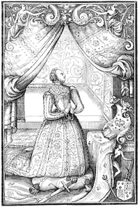
and most of the woodcuts had the same origin. In the early part of the century most of the publications were translations of popular foreign books, such as Voragine's " Golden Legend," Caxton's translations of Cicero, Boetius, etc. Too many restrictions and privileges obtained to encourage or allow of the establishment of an English school, which was to come later with the spread of wealth and education. Books were mostly printed in Gothic type, or " black letter," and the woodcuts were of the coarsest kind. An exception was the beautiful Prayer-book of John Day, 1578, known as Queen Elizabeth's Prayer-book, from the fine portrait of the Queen, which we reproduce, on the previous page ; but in this the woodcuts were designed by Albert Dürer and Hans Holbein. Pynson was the first to use Roman type in England, in the Oratio in pace nuperrimâ, 1518, quarto ; and the first English Bible in Roman type was printed at Edinburgh in 1576. It is thought that until about 1600 printers were their own type-founders, as no record exists of founding as a separate trade until that time.
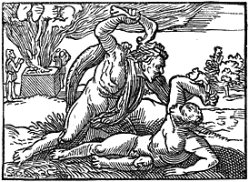
The greatest achievement of the sixteenth century in England was the printing of the first English Bible, in Coverdale's translation, in 1535, folio, but even this was printed abroad, the latest investigation giving it to Van Meteren at Antwerp. The woodcuts in it are by Hans Sebald Beham ; we reproduce one representing Cain killing Abel. Tyndall had previously printed abroad an English New Testament. Another importation was Brandt's "Shyp of Folys," printed by Pynson, 1509, and John Cawood, 1570, the woodcuts in both being copied from the originals before referred to.
Folio was the size usually adopted, and in this size the series of chronicles appeared : Arnold, printed abroad in 1502 ; Fabian, in 1516 ; Froissart, by Pynson, in two volumes, 1523-5 ; Harding, by Grafton, 1543 ; Hall, by the same, 1548 ; Holinshed, in two volumes, 1577. In the same size Chaucer was first given to the world entire by T. Godfrey in 1532, and many times reprinted, and Sir Thomas More in 1557.
Cain killing Abel.
Polemical and religious treatises were mostly printed in quarto, as were the poets : Spenser's Faerie Queene, in 1590 ; Langland's Pierce Plowman, in 1550 ; and Sidney's Arcadia, in 1590. Plays were also printed in quarto, in which shape at the end of the century some of Shakespeare's single plays were issued.
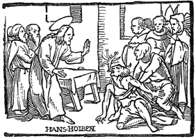
From the great perfection to which the liturgies, or books of hours, had been brought by Vostre, Verard, and others in France, it is not perhaps extraordinary / p.148 / that the service books for English use should have been mostly printed abroad. Those for Salisbury and York were produced at Paris, Rouen, and Antwerp. A Salisbury Primer in English was printed by John Kyngston and Henry Sutton in 1557, and Wynken de Worde printed a York Manual in 1509. The first English Common Prayer Book, known as Edward VI.'s, was printed by Grafton in 1549, who also printed in 1545 Henry VIII.'s Primer in Latin and English. Edward's book is curious as having on the last page a royal order as to the price at which it was to be sold : "No maner of persone shall sell the present Booke vnbounde aboue the price of two shillynges and two pence. And bound in Forell for iis. xd., and not aboue. And the same bound in Shepes Lether for iiis. iiid., and not aboue. And the same bounde in paste or in boordes, in Calues Lether, not aboue the price of iiiis. the pece." Cranmer's Catechism was printed by Nicholas Hill in 1548, with twenty-nine woodcuts by Hans Holbein, one of which we reproduce, representing Christ casting out devils.
Translations from the classics were popular, and in the second half of the century arose that passion for voyage and travel which has so largely contributed to the wealth and extension of England. This was begun by Eden's translation of Peter Martyr's " Decades of the New World ; or, West India," London, 1555, quarto, followed by Hakluyt's " Principall Navigations, Voyages, and Discoveries," 1589, folio. Many accounts of single voyages and discoveries were issued, and the taste thus created culminated in the establishment of the East India Company in the last year of the century.
The first specimen of copper plate engraving for books in England is a frontispiece to Galen's De Temperamentis, printed at Cambridge 1521, and the number of books containing copper plates engraved before 1600 is extremely limited, the most notable being portraits of Queen Elizabeth, Lord Leicester, and Lord Burleigh in Archbishop Parker's Bible of 1568 ; Saxton's Atlas, 1579, the first atlas in England ;
Harrington's translation of Ariosto, 1591, with forty-seven engraved plates.
The first printer at Cambridge was John Siberch, 1521. Peter of Treves established himself at Southwark in 1514. Among his productions is a Higden's Polychronicon, 1527, folio. John Oswen printed at Ipswich 1538, and among the English towns in which printers established themselves in the century were York, Canterbury, Tavistock, Norwich, and Worcester.
The establishment of the Reformed Church, and the diffusion of education among the people which followed, / p.150 / created an original English school of literature in the sixteenth century, and this gave employment and great impetus to typography in England, so that by the time we reach the end of the century we find a great improvement in the art of the Book, to be carried to still greater perfection in the next.