| Bouchot navigation page, Preface, Chapter 1, Chapter 2, Chapter 3, Chapter 4, Chapter 5, Chapter 6, Chapter 8, Chapter 9, Index |
CHAPTER VII.
TYPES, IMPRESSION, PAPER, INK.
 FTER this summary, and necessarily very compressed, sketch of the general history of the Book, it will not be without importance to place some technical information before the reader, to explain as clearly as possible the function of the presses, the practical side of typography, from the engraving of the character and the founding of types up to the binding, taking by the way composition, impression, and collation. Many of these operations have been already sketched in the preceding part of our work ; we have spoken of engraving of the punch, of impression, of the thousand details that constitute the typographic art, and the knowledge of which is so little diffused. We return to it now, with more method, on the different subjects, and shall try to point out the principal features.
We have seen in our first chapter what patient researches the discovery necessitated for the Mayence printers in the founding of the character in matrix. True, the punch and the matrix had existed from time immemorial for coins and seals. To engrave in relief a / p.240 / punch of material hard enough to strike a resisting metal, and to run into the space obtained by this blow a melted alloy, which took at its extremity the same form as the punch had given, is, in a few words, the whole economy of the process. For the engraving of the punches a sort of burin of tempered steel was used, which scooped out the part intended to remain white in the letter.
From the beginning the printers themselves engraved their own characters. The most ancient, whose constant preoccupation was the imitation of manuscript, copied the Gothic letter of ordinary writing. Soon afterwards, Jenson, the French refugee at Venice, designed a round letter, like that of Sweynheim and Pannartz, the Roman publishers, in 1467 ; and his type, absolutely perfect, is used to this day.
In France the introducers of the invention in Paris also imitated the Roman, but multiplied abbreviations until they became tedious. We can imagine what the engraving of a character could be where so few letters stood alone, where lines abridged the nasals ; the words pro, pre, figured as in manuscripts ; the sign 9 signified cum or con in Latin or French words, without reckoning a thousand other rigorous usages. This truly perplexing profusion of signs as well as the want of precision and clearness in the letter enables us now to recognise the first Parisian incunabula.*
* See above, figs. 10, 11, 12.
---------------------------
The first English printers used Gothic or black letter. Caxton brought his first fount from Cologne, but that which he made afterwards for himself was of the same character. Wynkyn de Worde, Pynson, and / EARLY TYPE-FOUNDERS. p.241 / their successors used the same style ; and for official publications and Bibles the black letter was used up to the seventeenth century.
But the art of the founder-engraver was destined to specialise itself. There were artisans in this
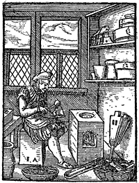
branch, and among them in France, in the fifteenth century, Simon de Collines, who engraved good Roman characters about 1480. Later was Claude Garamond, of Paris, who died about 1561, a pupil of Geoffroy Tory, the most celebrated of all of them ; Tory definitely / p.242 / proscribed the Gothic character, of which Vostre and Verard had made constant use. Garamond worked in this way, producing with microscopical precision new letters, among others those of Robert Estienne, the most marvellous and the most distinct. It was he who was charged by Francis I. to form the celebrated royal Greek types. He assisted in getting up the Champfleury of Geoffroy Tory.
On his death William Lebé succeeded him, and inherited his punches. Lebé engraved by preference Hebrew characters, of which he made a specialty. His travels to Rome and Venice had given him a singular value in his art ; and when he died about the end of the century, he was incontestably the first cutter of Oriental characters in the whole world. Philip II. of Spain had begged him to engrave the letters of the Bible of which Plantin had undertaken the impression, and Francis I. had charged him to make types for the Estiennes.
At the commencement of the seventeenth century we find James Sanlecque, pupil of Lebé, and his son. During this period several women succeeded their husbands as type-founders. In the eighteenth century Philip Grandjean, an artist who was royal printer to Louis XIV., was keeper of the foundry afterwards united, in 1725, to the Royal Printing House ; Fournier succeeded the Lebés, then P. S. Fournier the younger, who engraved with great success. In our days we have seen above the Didots themselves working their punches ; and one of them, Henri, founded microscopical characters for a La Rochefoucauld about the middle of the nineteenth century.
We have referred to English type-founders of the eighteenth century in Chapter V.
The type, or character used in printing, is a composition of lead and pure antimony, which, melted, form a resisting and at the same time supple mixture. Lead alone would be crushed, and the first printers often suffered in making their experiments. The proportion of the mixture is four of lead to one of antimony.
The matrix is combined in such manner that the eye—that is to say, the part of the character intended to produce the impression—and also the shank intended to hold the letter are cast together.
The letters, once founded according to their different forms, are afterwards disposed in boxes with compartments, or " cases." These cases serve to classify the character by letters, italics, capitals, lower case, punctuations, accents, etc.
As we have said, the relation of letters among themselves in the composition of a language is called the " fount." For example, it is certain that the Italian employs the letter a more than b, the letter a appearing in nearly every word ; a compositor to compose in this language should therefore have more of a than of b. The relation between these two letters and all the others is the " fount." In French the proportion of a fount is about 5,000 a for 800 b, 3,000 c, 3,000 d, 11,000 e, etc. The fount varies with the languages. In English the proportion is 8,500 a to 1,600 b, 3,000 c, 4,400 d, etc.
Before 1789 there were in all twenty different "bodies" of letters that bore fantastic names. The / p.244 / "Parisienne" was the smallest size, and the "Grosse Nonpareille" the largest. In the sixteenth century a character called "Civilité" was invented. It sought to imitate fine cursive writing. In the last century this idea was reproduced, and the " Bâtarde Coulée," which did not have great success, was made. In
English types, Joseph Moxon in 1669 had eleven sizes ; Caslon in 1734 had thirty-eight.
When a printer wishes to compose a work, he first decides in which body he will print it. His choice made, he places in the compositors' "cases"— that is, in the boxes placed before each one of his workmen—the chosen character, with its italics, capitals, signs, etc. Then he gives them the " copy," that is to say the manuscript of the author to be reproduced. The com- / IMPOSITION. p.245 / positors take a "galley" according to the size of the book ; and, letter by letter, by running their fingers through the different cases, they place side by side the words laboriously composed, and necessarily presenting their reverse, so that they will show their proper face when printed.
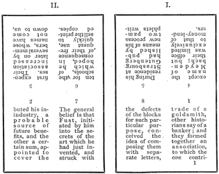
The composition terminated, the process of "imposition" takes place. This is the disposition by pages in an iron chase, in such manner that the sheet of paper shall be printed on both sides, the pages exactly following one another.
It will be seen by the specimen on the preceding page that if the two sheets be brought together, page 2 of II. will fall exactly opposite page 1 of I, page 7 opposite page 8, and so on. Nothing is easier than this combination for folio, quarto, or octavo sizes, but as the smaller sizes are multiplied even to 128mo, tables are necessary to prevent error.
The imposition is completed by building up the composition in a chase by means of pieces of metal called " furniture," which regulate the margins. When the whole is in proper place, it is squeezed up and adjusted by means of sunk reglets. The chase may now be placed under the press without fear of the characters falling out or getting mixed.
A pressman takes a "proof" after having rubbed the relief of the characters with ink, and on this proof are corrected the author's or compositor's faults by indications in the margin by understood signs. By this amended proof the compositor amends his faults one by one : leaves out superfluous characters, puts turned characters straight, spaces or draws closer the lines, etc.
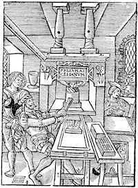
The corrections finished, the time has come to print. In the time of Geoffroy Tory this operation was made as we shall explain ; it was the same before and the same after. Two pressmen have tempered with water the tympan, or more elastic part of the carriage, against which will be directed in good time the blow from the type ; they have also damped the paper intended for the impression, so that it may retain the greasy ink with which the characters are charged ; then the formes are washed before putting them under the press.
In the figure which we reproduce, which dates from about 1530, we see the workshop of Jodocus Badius, of Asch, father-in-law of two celebrated printers, Vascosan and Robert Estienne. The press rolls—that is to say, the formes—have been placed in the " carriage," or movable chase, which, coming forward, receives the sheet of paper and the ink, and returns under the press to receive the blow of the " bar." In the room, lighted by two windows, the compositors work. In front one works at the bar, while his comrade distributes the ink on the " balls." These balls are leather pads, on which the greasy ink, made of lampblack and oil, is spread, to more easily rub the forme after each blow. Ordinarily the inker had two functions : he prepared the ink, distributed it, and kept his eye on the printed sheets to correct faults, blots, and difference of tint. Here the workman is simply occupied by the balls. Printed sheets and prepared paper are on a table by the side of the press. This press is composed of the rolling chase, the tympan, and the " frisket," a smaller tympan, which work against one another. The tympan, we have said above, receives directly the blow.
/ PRESS WORK IN THE SIXTEENTH CENTURY. p.247 /
And it was so for nearly four centuries ; the mechanical means of our days have a little changed the work, but the principle is always the same.
Towards the end of the sixteenth century, a press cost about a hundred and twenty-seven crowns, with its diverse utensils, as may be seen in an unpublished / p.248 / piece analysed by Dr. Giraudet, of Tours, in a very interesting pamphlet : Une Association d'Imprimeurs et de Libraires de Paris Réfugiés à Tours au XVIe Siècle. The workshop of Jamet Métayer, of Tours, cost a rent of eighty-three crowns—about twenty pounds of current money.
Workmen were then paid by the "day;" and it came to be one of the expressions then so much used in manual labour, corresponding to the sum of the least work of a good workman. M. Ladevèze, printer, thought that the "day" represented the work of about twenty thousand Roman or Cicero letters employed by a compositor.
With us the "day" of compositors and pressmen is differently calculated. The latter have to take a certain number of sheets.
The sheet, composition and press work, cost nearly seven crowns, or nearly two pounds. Jamet Métayer paid twenty crowns for four sheets in Italics ; he demanded three months for the work.
The primitive presses were wooden screw presses, and they so remained until the beginning of this century, when Lord Stanhope, a celebrated electrician, author, and politician, perfected them and gave his name to a new machine. His improvement consisted in that the bar was no longer fixed to the vice, but to a cylinder outside. A counter-weight brought back the platen at each blow. Pierre Didot had previously made metal platens. In 1820 the use of the Stanhope press commenced in France.
England had, besides, taken a preponderating place in typographical invention. The printer of the Times, / PRINTING PRESSES—PAPER. p.249 / John Walter, at the beginning of the nineteenth century, seeking to publish his journal quicker, associated himself with craftsmen who constructed mechanical presses for him. The Didots lost no time, and themselves made improvements.
In 1848, the presses of the Constitutionnel, thanks to the application of steam, produced twenty thousand papers an hour. In our time there are machines that print only on one side, as well as double machines, printing both sides at once. The rotary machines, with endless paper, take thirty-five thousand impressions an hour. In the newspaper machines of Marinoni, the great inventor, the paper is unrolled, printed, cut, and folded without leaving the machine, and falls into a place from which it is taken ready for the subscriber. The latest perfection of the printing press is the Walter press and the rotary machine of R. Hoe and Co., of New York, extensively used throughout the world. The elaborate book has little to do with these marvellous processes, although in its turn it largely benefits by the improvement of the printing machine.
It is apart from our purpose to speak at length on the manufacture of paper. It is certain that it was well made before the invention of printing, for most of the accounts of the fifteenth century are written on linen paper, very resisting and well sized. Later on rags were used in this manufacture ; and here, in a few words, is how paper was made in the mould, or "hand-made" before the invention of machinery for the purpose :—
The rags, having been thoroughly cleansed, were put into vats, where they were worked up under a beating press until they were reduced to pulp. This pulp was / p.250 / thrown into hot water and stirred until the mixture was uniformly made. Then a mould of fine wire cloth, fixed upon a wooden frame, and having a "deckle" to determine the size of the sheet, was taken ; in the middle of this frame was disposed, also in brass wire, a
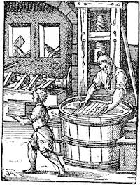
factory mark, intended to appear in white in the sheet of paper, and called the "water mark." This mould was dipped into the vat of pulp and drawn out again. After gently shaking it to and fro in a horizontal position, the fibres of the pulp became so connected as to form one uniform fabric ; and the water escaped / PAPER MANUFACTURE. p.251 / through the wires. The deckle was then removed from the mould, and the sheet of paper turned off upon a felt, in a pile with many others, a felt intervening between each sheet, and the whole subjected to great pressure, in order to absorb the superfluous water. After being dried and pressed without the felts, the sheets were dipped into a tub of size and again pressed to remove surplus size. This primitive method of paper-making is represented in fig. 104, and the same principle is still in use for the production of hand-made paper. Machinery has effected many improvements
|
China and Japan have their special paper manufacture. In Japan the material employed is the bark of the morus papifera sativa.
According to their fineness, size, and weight, papers have received different names, proceeding from the water mark.
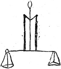
Faust at Mayence used paper marked with a bull's head. Jenson at Venice used a balance of which the form varied. This latter came from a mill which furnished Vicenza, Perugia, and Rome. Jenson used, besides a crown, a cardinal's hat.
The bull's head underwent transformations, it had stars and roses, and was special to Germany, and it may sometimes be found in Italy.
The wires and bridges served to determine the size of a book. Looking at a folio leaf against the light, / p.252 / the wires will be seen to be horizontal, and the bridges vertical. In quarto they will be reversed, the paper having been folded in four instead of in two. The bridges become horizontal. They return to the vertical in octavo, and so on.
As for ink, it was from the beginning a composition of lampblack and oil of different quality and nature, mixed with resin to obtain a greater and quicker dryness. Ink for engravings was more carefully made. For coloured inks various powders are mixed with the oil and resin, and a title in red and black has to go through the press twice : once for the red and once for the black.
From the above it can be understood that illustrations in relief can easily be introduced into the composition, whether in combination with text or in separate pages. Another question presents itself : Did the old printers employ casting, or did they print directly from the wood block itself ? In other words, the block having been cut, did they make with it a mould into which melted metal could be poured to obtain a more resistant relief ? The fact is difficult to elucidate. It appears to-day that Simon Vostre, Verard, and others printed relief engravings on metal, but were they cut directly or obtained by casting, as they are now ? It cannot be determined yet.
