| Bouchot navigation page, Preface, Chapter 1, Chapter 2, Chapter 3, Chapter 5, Chapter 6, Chapter 7, Chapter 8, Chapter 9, Index |
CHAPTER IV.

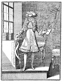
Fig. 69.—Letter engraved by A. Bosse.
It is not that artists were wanting at the opening of the seventeenth century who could, in giving scope to their talent, show themselves worthy successors of those who went before them. Unhappily the booksellers no longer had a loose rein ; they had the rope, for they were hung or burned at the least infraction of political or religious propriety. Yet the reign of Henri IV. was relatively an easier period for the artisans of the Book, in which they were less confined to the strict terms of excessive regulations ; but after this prince severity increased, and during the year 1626 a new law was promulgated punishing with death the printers or distributers of prohibited books. Doubtless the books that were thus secretly sold, and prohibited in defence of good manners, were neither chefs-d'œuvre of typography nor art. The author threw off the indecencies by which he hoped to make profit and fame, regardless of type or illustration. But during the regency of Marie de Medicis, it was not only the authors of a bad standard that were in danger of being hung ; the printer or seller of the pamphlet or book of a reputed heterodox author was also hung, and it
became difficult to steer safely among the prohibitions. Enormous numbers of works were made with frontispieces decorated with colonnades and mitred saints, and bearing high-sounding titles of sound orthodoxy. A somewhat gross mysticism, from the office of Plantin, formed the most solid stock of every respectable dealer.
Under Henri IV. and the minority of Louis XIII., two French illustrators received from the school of Antwerp their inspiration for the ornament of the Book. Thomas de Leu, probably from Flanders, was allied with the old Parisian painter and engraver of celebrated portraits, Antoine Caron, in furnishing the engraved plates for the Images de Plate Peinture des Deux Philostrates, Sophistes Grecs, Paris, Claude Cramoisy, 1609, folio ; and Leonard Gaultier, his contemporary, collaborated with Jaspar Isaac and other artists in the Book. Leonard Gaultier contributed most to spread in France the Plantinian style, and his somewhat cold but characteristic talent suited this art more than that of any one else then could. He was an engraver of portraits, now rare and valuable, in the style of Wierix or Thomas de Leu ; but, at the demand of publishers and booksellers, he composed other plates, at first historical figures representing the royal family and the nobles for the publisher Leclerc, in a simple and true manner ; he also designed pious figures, recording a miracle or representing the ceremonies of a jubilee and other devotional things. But he made his great success in the composition of frontispieces to theological and pious works, printed for nearly all the booksellers. Leonard Gaultier had a fashion of his own with pilasters and Grecian columns, under which he boldly placed entire councils of cardinals
/ LEONARD GAULTIER. p.155 /
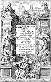
and bishops ; witness the heading of the Bibliotheca Veterum Patrum, into which he crowded nearly forty figures. He united also with a certain grace the sacred and the profane, placing among ideal saints the sinning fine ladies of the time, with their large collarettes and jewels falling on naked breasts. The work of Andrew Valladier, chaplain of the King, entitled Métanéalogie Sacrée, published by Peter Chevalier in 1609, was adorned with a title of this particular kind, in which Gaultier had no rival, and which preserves the precision of Flemish masters in the detail of ornaments of the toilet.
He was one of the first to work for Sebastian Cramoisy, printer and publisher, who had established his shop in the Rue St. Jacques at the sign of the "Stork." We shall have occasion to speak of him later in connection with the Royal Printing House, of which he was the first director ; he is mentioned now because in 1611 Leonard Gaultier engraved for him the frontispiece of L'Aigle Français, a collection of sermons by Thomas Girault. The publisher used the same plate in 1618 for the sermons of Raymond de Hézèque.
Besides the publications of Sebastian Cramoisy and Chevallier, Leonard Gaultier adorned also those of Nicholas Buon and many other publishers of the time in Paris and Lyons. With such a profusion of works emanating from a single artist, without reckoning those which were produced in great quantity by men of less note, wood engraving was dead. At most it dared to put a wood block of a printer's mark on a title ; more ordinarily this mark was not alone sufficient, and showed the disdain in which taste then held wood- / p.156 / cutting. Thus goes fashion, heedless of the most elementary rules of art. To put type within an engraved title, or to ornament a printed text with engravings, is a heresy of principle that was established in the eighteenth century, by the strength of its cleverness and talent. But at the beginning of the seventeenth, in spite of Leonard Gaultier or Thomas de Leu, these overloaded titles, overpowering the opening of the Book, offend the eye by their excessive blackness, and incontestably make us regret the admirable frontispiece on wood of the preceding century.
This is all the ornament, properly so called, of the reign of Louis XIII. Leonard Gaultier composed also small vignettes for an edition of Homer, but they are mediocre and unskilful, and it must be said that there were others following the same path. John Picart made a frontispiece with architecture and figures for the Histoire de la Maison de Châtillon-sur-Marne for account of Sebastian Cramoisy. A cold and hard artist he was, the rival of Gaultier, and one of the most employed of the vignette engravers of Paris. There was also Jaspar Isaac, a mediocre craftsman, but who could design clever titles, among them that of the continuation of the Annales of Baronius for the publisher Denis de la Noue. Then Claude Mellan, whose great and clever talent did not disdain second-rate works, in which he gave free play to his burin. It must be said, however, that his bold touch did not well accommodate itself to reduced spaces, and that he was not working in the field necessary to his inventive powers. We mention his portrait of Louis XIV. at the head of the Code Louis XIV.; the title of the Perfection du Chrestien, in which
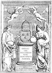
is included a portrait of Cardinal Richelieu, A. Vitré, 1647, folio ; that of the Instruction du Dauphin for / p.158 / Cramoisy, 1640 ; that of the works of St. Bernard for the Royal Printing House ; and, perhaps the best of all, the Poésies of Pope Urban VIII., of which we here give a copy.
Lyons did not remain far behind in the movement, but how changed from its great reputation of the sixteenth century ! J. de Fornazeris engraved the frontispieces to Justus Lipsius, published by Horace Cardon in 1613. Peter Favre and Audran imitated them. C. Audran designed for Claude Landry the Theologia Naturalis of Theophilus Reynaud, and the bookseller Picquet ordered from him the title for the Annales Minorum in 1628. Everywhere taste was modelled on the works of the capital, to name only the principal centres, Rouen, Rheims, Sens, down to Venes, a small town of Tarn, where William de Nautonnier published in 1603 his curious book Mécométrie, whose frontispiece was bordered by views of cities, with an equestrian portrait of King Henry.
And if we pass to Germany, we find Mayence with mediocre engravings for titles according to the formula and process used elsewhere, the title of the Droit Civil of Aymar Vailius, that of the works of St. Bonaventura in 1609 for the bookseller Antoine Hiérat, and that of the Viridarium Virtutûm, rather cleverly treated by the burin in 1610. What a period had passed since Gutenberg, Fust, and Schoeffer ! There was still one Yves Schoeffer at Mayence, but only the name lived ; nothing more remained of the old printers of the other century. It was the same at Bamberg, Cologne, Nuremberg, and Basle, in all the cities that made the honour of typography and the Book in former times. Cologne / GERMANY AND ITALY IN THE 17TH CENTURY. p.159 / was neither better nor worse favoured than others. The booksellers Boetzer, Kinck, and De Binghy had passable engravings for their titles ; and the Commentaries of Salmeron may be mentioned, with portraits from the German originals of the fifteenth century. At Nuremberg there was a curious specimen treating of natural history by Basil Besler, in which the artist gives the interior of a zoological cabinet of the time ; but the blocks and the typography of the city of Koburger are wanting. Basle held its own later in relief engraving. Meantime there was a mediocre set of the Dance of Death on copper, published by Miegen, 1621.
At Jena and Frankfort-on-the-Main were prosperous printing houses, but engravings and ornamentation were neglected. Frankfort employed the frontispiece in the Traité du Commerce of Sigismond Scaccia, published by Zuner in 1648 ; it was divided into compartments, in which the Bourse, the Exchange, and the port of the city were represented.
It is scarcely necessary to mention the Italian cities which followed the movement. Venice from the middle of the sixteenth century had used engraved frontispieces, among which was that of Domenic Zenoi for the Portraits des Hommes Illustres of Nicholas Valegio. In the same city James Piccini worked for account of Sgava in 1648, but he was equally at the service of Roman publishers, for whom he designed a number of titles. Along with him Frederic Greuter adorned the publications of Alexander Zanetti, not without talent, but without individuality. Bologna, Brescia, Florence, and Naples, had no original sentiment ; they followed indifferently the manner of the day.
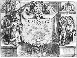
In Holland, artists were rather numerous. The family of the Passes designed vignettes for books, and engraved frontispieces, admirably studied and composed. The clear and truly personal style of their works places their illustrations in the first rank among those of their time. They had, at the same time, the genius that created and the intelligent burin that faithfully translated an idea. They imagined with art the scenes that they depicted without at all copying their predecessors. From 1599, the date of the publication of the Hortus Deliciarum, one of their best works, up to about 1623, they were in Holland, at Arnheim and at Amsterdam. In 1623 we find one of them, the most celebrated, Crispin the younger, designing figures for the Manège Royal of Pluvinel, published by Angelier in Paris, and for another edition, with folding plates, in 1624 for William Lenoir, at the sign of the "White Rose Crowned." This magnificent work, in which the King, Louis XIII., is represented receiving lessons from the rider Pluvinel, had a third and more complete reimpression in 1625 with another publisher, Michael Nivelle. Here we see the Dutch accredited in France, in Paris, in the city then the most ready to understand and pay for the works of eminent artists. In 1624 Gombauld published an Endymion—Boileau later associated Gombauld with other poets to declare him a maker of pitiable sonnets—Nicholas Buon, the bookseller named above, undertook the publication, and employed Pass, Leonard Gaultier, and J. Picart to furnish plates in octavo size. Heavy and black as were these vignettes, they do not the less make a good appearance in the edition of the forgotten
poet ; and it is due to truth to recognise how much Pass was above his collaborators. The following year, 1625, he engraved the Dionysiaques of Nonus, for Robert Fouet, and the Roman des Romans of Du Verdier, comprising more than ten engravings, in a very free and bold manner. The Berger Extravagant and the Académie de l'Espée came in 1628, among numerous others.
To speak truly, Crispin Pass did not devote himself entirely to Parisian publishers ; he always preserved interests in Flanders so as to return there from time to time ; but he did not find in his own country the ready and assured sales of Paris. Still the city of Leyden had then one of the most renowned workshops of typography ; the Elzevirs had commenced to make a good place for themselves among the printers of Europe by the extreme correctness of their editions, the distinctness of their work, and their marvellous art in the taste and economy of the Book. In reality, the sizes and characters of their books were very small, but if the smallness of the page did not allow room for vignette or ornament, they bore a certain practical elegance that was not without charm. The origin of the printing house was due to Louis Elzevir, who published in 1592 an edition of Eutropius at Leyden. He left sons, who associated themselves together, and founded a house which was unrivalled.
Bonaventure Elzevir, grandson of Louis, was the most illustrious of this family, so remarkably devoted to its art. He took Abraham as partner, and together they put forth those little Latin classics in duodecimo of which the value is now so great. Among others, Pliny issued from their presses in the year 1635, in three
/ THE ELZEVIRS. p.163 /
volumes, Virgil in 1636, and Cicero in 1642. To-day amateurs, above all those afflicted with bibliomania, hunt for unbound Elzevirs, because they have full
margins. From about 1633 to 1639 these volumes were composed of paper of rather small size, making a page of a hundred and thirty to a hundred and thirty- / p.164 / three millimetres ; from 1639 onwards the paper was larger, and the page from about a hundred and thirty-five to a hundred and thirty-seven. One must be a book-lover to understand the interest attaching to these figures, and employ his entire activity in the discovery of these undiscoverable books, which are concealed as soon as they are met with.
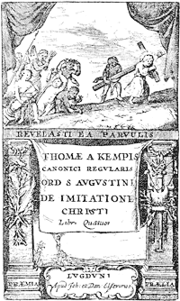
One of the most esteemed of their works is the De Imitatione of Thomas à Kempis, printed by John and Daniel Elzevir about 1653, and known as the edition without date. But as the association of John and Daniel is known to have lasted from 1652 to 1654, the date 1653 appears to be very plausible. We reproduce the entire title of this typographical bijou, which merited a cleverer engraver.
The rarest of all the numerous Elzevirs, possibly by reason of the popularity of its subject, is the Pastissier François, Louis and Daniel Elzevir, Amsterdam, 1655, of which M. Morgand had an uncut copy, measuring a hundred and forty-three millimetres, in 1878. The Benzon copy sold in 1875 for three thousand two hundred and fifty-five francs.
It is to be remarked that the Elzevirs frequently avoided dating or even signing their books, for reasons easy to comprehend. Publishing numerous works, they were afraid of compromising themselves in the eyes of the powerful, and they let them go forth without any trade mark. These artists in typography were, besides, the most prudent and subtle of men. Working at a time when bookselling had become an acknowledged commerce, and a trade requiring all the skill and resources of others, they wisely availed themselves of / CRAMOISY—FRENCH COMPANIES. p.165 / these, gathering for themselves honour and profit without having done more than seize their opportunity. Employing the characters of Claude Garamond, of James Sanlecques, and the papers of Angoulême, M. Didot thence claims them as French publishers.
In France the Elzevirs had no rivals ; but a fashion was introduced from the end of the sixteenth century of associating together publishers in the production of important and costly books. There were, among others, the company of the "Grand Navire" in 1610, of the "Source" in 1622, and of the "Soleil" in 1629. In 1631 several publishers united and founded a second company of the "Grand Navire." These were the two Cramoisys, Sebastian and Gabriel, Denis Béchet, John Branchu, Denis Moreau, Claude Sonnius, and Denis Thierry. The associates took a ship as their mark, but without putting their names on the masts, as the original company of the "Grand Navire" had done. They published, at common expense and divided profits, great works, of which each one of them had the right of sale, but of course reserving to themselves the right to publish such others as they pleased. Sebastian Cramoisy passes as the chief, the moral director of another company, formed to publish the Fathers of the Church, with the royal types, a company affiliated to the "Grand Navire" and signed in 1638 by Denis Moreau, Gille Morel, Stephen Richer, Claude Sonnius, and Gabriel Cramoisy. But as regards their personal works, if they had neither the perfection nor the aspect of those of Froben, Aldus, the Estiennes, or even of Plantin, they at least surpassed the French books of the time. Formerly syndic of the Corporation in 1602, twenty- / p.166 / nine years before the constitution of the "Grand Navire," Cramoisy was besides sheriff of Paris, and he exercised his trade in a shop in the Rue St. Jacques which had been that of Father Nivelle, the doyen of booksellers, who died in 1603 at the age of eighty years.
The position of Cramoisy made it natural for Cardinal de Richelieu to fix his eyes on him for the direction of the Royal Printing House. This establishment, founded by the King in 1640, was installed within the Louvre, in a long series of rooms which formed a workshop without rival in the world. Sublet des Noyers was named superintendent, Trichet du Fresne corrector ; and under this triple direction the presses commenced to work. The first book was the Imitation de Jésus-Christ, dated 1640, folio, a fine book enough, but not to be compared to the Elzevir editions. The types used in this book are attributed to Claude Garamond, founder of the sixteenth century, to whom are due the Greek types of Francis I. With the Royal Printing House, as often happens with State enterprises, the cost was great, and the return nothing. Only a few years after its foundation it had swallowed up nearly 400,000 livres, a very heavy sum for a badly balanced treasury ; it had produced sixty or seventy volumes of moderate value ; and after Cramoisy the management was so little in earnest that it turned the workshops into a stable, called "the little stable of the King," at the commencement of the eighteenth century.
To return to the artists of the Book under Louis XIII. and Cardinal Richelieu, we must go back a little, before the foundation of the Royal Printing House, and we shall find the French school of illustration at a time / CALLOT'S ILLUSTRATIONS. p.167 / when Callot was giving it a vigorous lift and trying to do away with its affected and hard style. It must be acknowledged that Callot was not a vignettist, a special designer ; his art aimed higher, and ordinarily succeeded better ; yet he did not disdain frontispieces, and made them for the Coustumier de Lorraine, the Harpalice of Bracciolini, and for a crowd of others of which the
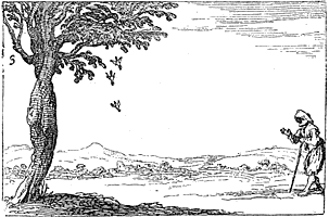
enumeration would be tedious. Certain of his works passed into Italy, where they raised a little the debased level of the Book. Then he adorned several works with etchings, among them the Lumière du Cloistre, published by Francis Langlois 1646. It was one of the symbolic and sententious works with which the public taste is never satiated, and a kind of guide for the priest. At the bottom of the little etching here given, representing birds falling from a tree, we read,—
|
" Ses petis hors du nid le courbeau jette en bas, Lorsque par leur blancheur ils lui sont dissemblables. Le bon prélat de mesme au cloistre n'admet pas Ceux qui n'ont rien d'esgal à ses mœurs venerables." |
Callot also made another set of emblems on the life of the Virgin Mary, and published in 1620 a series of prints in quarto for the tragedy of Soliman of Bonarelli, for the account of Cecconnelli. France imposed herself on fallen Italy, she got her works dispersed there, and if an engraver arose there, he did not disdain to consecrate himself to France. Witness Della Bella, who went from Italy to France, where he was taken under the protection of Cardinal Richelieu. It was about the time of the establishment of the Royal Printing House, and it was expected that employment would be found at once for him.
Callot was the model chosen by the young Italian artist, and this choice might have been less happy. Della Bella took from his master the philosophic vein, the drollery of design, which he exercised at first in humorous frontispieces, among others that of Scarron's works, where nine fish-women, taking the place of the Muses, dance around the poet. But he passed from gay and pleasant to severe, and made large pages of architecture for serious titles. In 1649 he designed the plates for the large and undigested volume of Valdor on Louis XIII., published by Antoine Estienne at the Royal Printing House. His success was not there ; Della Bella was a painter of groups, of ornaments, of subjects somewhat heavy and overdrawn, but which, after numerous transformations, opened a new way to the vignettists of the eighteenth century.
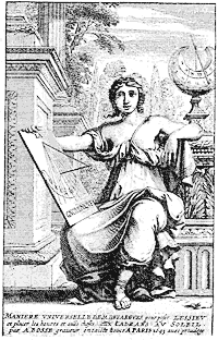
With Abraham Bosse the decoration of the Book took a considerable extension. Numerous and charming ornamented letters, heads of pages, and tailpieces appear. There are few artists that have done so much as he for graceful illustration and harmony between the vignette and the printed page. His prodigious fecundity made him attempt every style ; and after the gaieties of the print in which he laughed with his contemporaries, he adopted a grave air to trace more severe subjects on copper. However, the book entitled La Manière Universelle, by Desargues, with numerous geometrical figures and an agreeable frontispiece, bearing the dedication to the Seigneur de Noyers, superintendent of the Royal Printing House, was a critical work, in which Bosse, under a serious standard, did not spare an enemy. We do not bear ill-will to the artist, however, for the following year he published fourteen plates for the Suetonius printed at the Louvre.
He successively designed plates for the Histoire de St. Louis, numerous vignettes for pious books, figures for the Pucelle of Chapelain and for the Larcins de la Fortune. He was always himself, refined and ingenious, whether in the most barren or the most complicated subjects.
He has left us in a celebrated print a representation of a bookseller's shop of his time. It is for us an interesting page, in which is shown simply and rather naïvely the picturesque side of these stores, with the dealer and his wife selling new works to their customers. The shop is compact, and very much like the open-air stalls of to-day ; posting-bills above the shelves indicate the " new books ;" and if the in-
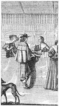
scriptions given by Bosse be credited, the Palace dealer offered his books with singular eclecticism : Boccaccio, / p.172 / Aretin, the Astrée of D'Urfé, the Bible, and Machiavelli. In the hands of the woman is seen the romance Marianne :
|
" Icy les cavaliers les plus adventureux En lisant les romans s'animent à combattre ; Et de leur passion les amants langoureux Flattent les mouvements par des vers de théâtre," |
If we credit Sauval, the great number of booksellers, in the middle of the century, was due to the wits of the Hotel de Rambouillet. The passion for novelty, for recent works, had produced that quantity of publishers, he says, that we have seen on the Pont Neuf, and that we still see to-day at the Palace and the University, but of which the number is so multiplied in all these places that in the Palace they count more than other dealers ; and as to the neighbourhood of the University, they are obliged, in order to lodge the rest, to extend the ancient bounds from St. Yves to the river (Sauval, Antiquités de Paris, viii., 354).
In fact, each year saw an increase in the number of publishers in corporation, with syndicate and adjuncts. Under the reign of Louis XIII., the single year 1610 had fifty to take rank, and among them Antoine Vitré, who was to become the most illustrious of his contemporaries. But, as there were no more than six printers, it may be inferred that all the rest were booksellers, in the true sense of the word, of those who encumbered afterwards the great salle of which Sauval speaks. Antoine Vitré was syndic in May, 1643, on the accession of Louis XIV. He had four adjuncts. With him / A. VITRE AND THE POLYGLOT. p.173 / the Book marked the solemn style that the commencement of the century had given to it. Royal printer for the Oriental languages from 1621, he undertook a Syriac work, the first that was attempted in Paris. The project of a Polyglot Bible gave him the idea of acquiring for the King the Oriental manuscripts and matrices of Savary de Brèves. The King left to him the care of negotiating the business, but did not reimburse him without numerous difficulties, in the midst of which the printer was made to lose the means of conveniently continuing his trade. The advocate Le Jay charging himself with the enormous expenses necessitated by the Polyglot Bible, it was composed in the hope that Cardinal Richelieu would pay the cost. He was willing to do so, but required that his name should figure on the book ; and as Le Jay, an independent man, formally opposed it, Vitré met with ill-will from the Minister, which increased from day to day. In 1645 the impression was finished, but Le Jay was ruined, and if we admire the paper, the type, and the extraordinary size of the nine volumes of the Polyglot Bible, we find in it so many faults, errors, and misprints that it has fallen to nearly nothing, hardly being worth its binding. There were terrible mortifications in the business, and Vitré had to submit to them more than any one. Nevertheless he did not let his presses stand still, and he published successively Arabic, Turkish, and Persian works. His action against the Savary heirs, as representing the King, in the acquisition mentioned above, continued also after the impression of the Bible, and hindered his progress. He struggled on ; and the assembly of clergy, of which he was the printer, sought / p.174 / to help him out of his difficulties. The matter being once terminated, the Cardinal being dead, and Vitré having been named by Colbert director of the Royal Printing House in place of Cramoisy, he died in his turn, and was later accused of having destroyed the types and matrices of the Polyglot Bible, so that they should not be used after him. This fable, long accredited, has since been ascertained to be false, for the punches and matrices passed to the Royal Library, thence to the Royal Printing House, reorganised in 1691.
Antoine Vitré, in spite of his misfortunes, was a great personage. He was painted by Champagne and engraved by Morin, as was Richelieu himself. The portrait was reproduced in the book of M. Delaborde, La Gravure (p. 189). Such was the man whom we meet at the beginning of the reign of Louis XIV. as syndic of booksellers ; and it was by no means a sinecure, a canonry giving honour and profit, quite the other way. With the Draconian rules on the subject, the syndic assumed a heavy burden towards the King, as well as towards his kinsmen. Religious quarrels envenomed questions, and the revocation of the Edict of Nantes was to have for its immediate corollary new and more severe royal ordinances.
The reign of Louis XIV. saw the zenith of engraving with the burin, but not that of printing or illustration. Doubtless it would be puerile to pretend that typography had not made any material progress ; it had done so in engraving and in composition ; work was done more quickly, because the presses had been made more perfect. But the wise harmony of the old printers, their sure taste, even in their old irregular / THE REIGN OF LOUIS XIV. p.175 / blocks, was no longer there to form a graceful and charming whole, which is to modern precision as a picture by Van Eyck is to a chromo-lithograph. Under Louis XIV., titles became regular, following, as we have said above, and modelling themselves on, the affected and peruked people who read them. All art entered on this path of sublimity and grandeur. The painter Le Brun is the highest exponent of this false Olympus, where an heroic pose became necessary for the most humble movements. Made popular by engraving by Pesne, Audran, Poilly, Edelinck, and a hundred others, this tendency overran everything : art and industry, painting and tapestry, illustration and typography itself. All was grand, in reverse of other times, when all was small and mean. The embellishments of the Book were full of gods in perukes and goddesses in armour, Louis XIV. as Apollo, as the sun illuminating the world. " Nec pluribus impar" was not the device of one man ; it was the mighty and glorious cry of a whole people, from great to small, from the sublime painter to the modest printer.
Ordinarily these exaggerations are not useful to the arts. Here they were. But, for the matter that specially occupies us, it does not appear that the Book was much advanced. It approached a marvellous epoch of a delicate and graceful art ; but it did not find its form ; it dragged painfully after the Plantinian works, heavily throwing its etchings and burins in the middle of texts, gross and in bad taste. Yet taste in literature had an onward tendency ; Molière and La Fontaine produced on their contemporaries the effect that in our day the naturalists have produced on the romanticists ; but / p.176 / this was not for long. Majesty recovered its rights with Bossuet, Boileau, and the others.
Sébastien Leclerc was one of the rare artists of the end
of the seventeenth century who dreamed of the vignette in the midst of this invasion of pompous commonplace. Successor of Callot in manner, induced by the publishers, he began this style with a romance of La / SÉBASTIEN LECLERC. p.177 / Calprenède, and continued with the Promenade de St. Germain of Louis le Laboureur, bailie of Montmorency, of whom Boileau said such curious things. This is one of the rarest books of Leclerc, and we reproduce one of the pages, with a charming tailpiece, which comes very near those of the eighteenth century. There was, moreover, a charm in this ingenious designer ; he adorned the works of his contemporaries with graceful vignettes and decorations full of suppleness. It may be believed, besides, that he did not remain behind his confrères in figure composition or allegorical and Divine emblems. His art did not throw off the errors of the existing school ; he was content not to copy any one and to make his works truly his own. Such were, for example, the vignettes of the Histoire de Turenne, where the heads of the chapters, the ornamented letters, and the tailpieces, harmoniously agree, and made the book, a little heavy in impression, a most agreeable work. Leclerc then found himself ready to design vignettes for the works of Racine for the publisher, Claude Barbin, another name frequently encountered in Boileau. The title of Vol. ii. merits attention.
The same year of this last publication, 1676, Sébastien Leclerc illustrated the " Metamorphoses" of Ovid for Benserade, the engraving of which cost the King more than 10,000 livres. Thus adorned, the book had not a bad appearance, but a satirist of the time, Hardin very probably, made on it this quatrain:—
|
" Mais quant à moi j'en trouve tout fort beau : Papier, dorure, images, caractère, Hormis les vers qu'il fallait laisser faire A La Fontaine."
|
It may be imagined what an engraver could produce working from 1650 and dying in 1715, that is, a life of work the longest that could be hoped for. Leclerc was the absolute contemporary of the King. He died, like him, at the beginning of the eighteenth century, leaving work widely scattered among books, funeral orations and placards. After the example of Callot and Bosse, he did not disdain satire. One of his prettiest vignettes served to illustrate some pamphlet of Richesource against the journalists of his time ; it represents a dandy of about 1679 offering his gazette.
By the side of this unrivalled antagonist it is permitted to place Lepautre, twenty years older than Leclerc, but whose studies had been principally on architecture. In the moments that he left his special work he devoted himself to frontispieces and vignettes ; nevertheless, although he had before him the charming designs of Leclerc, he confined himself to a cold and hard manner, keeping, besides, as much as possible to titles, in which his particular talent could find scope. He designed also the Chartreux Missal of 1679, the Gallia Christiana after Marot, the Dioptrique Oculaire of P. Chérubin, engraved by Edelinck, and a thousand other works of small repute.
Very different was Francis Chauveau, who, without having the delicacy of Sébastien Leclerc or his art of arrangement, treated at least with grace little figures and illustrations. Certainly there is an enormous distance between these correct and commonplace engraved plates and the delightful wood engravings of the time of Geoffroy Tory, for example. But, be
/ LECLERC, LEPAUTRE, CHAUVEAU. p.179 /
their worth what it may, they suited very well ; and even with Molière they did not make such a bad figure. Chauveau was associated with many of the
works of Leclerc, who caused him often to be less heavy, inasmuch as Leclerc corrected in engraving many of his compositions. It was so with Molière, / p.180 / and still more with Racine in the plate of the Plaideurs, in which Chauveau revealed himself a precursor of the eighteenth century. Unhappily he did not always follow this manner. Successively, and with various luck, he illustrated Alaric, Andromaque, and the "Metamorphoses" of Ovid for Benserade, with Leclerc ; the Pucelle of Chapelain, and the Tragédies of Racine, to which Le Brun did not disdain to put his hand.
In short, the connecting link between the beginning of the seventeenth and that of the eighteenth century in the development of illustration is Sébastien Leclerc. He had known the artists of the first period ; he was to see at his death appear one of the precursors of the vignettists of the following century, Claude Gillot. Thanks to him, overburdened titles and unskilful vignettes underwent a gradual transformation. In the delicacy and tenuity of his designs may be seen the dominant note of the eighteenth century, coquetry, and Choffard is divined. He was nearly the only one who did not fall into the exaggerations of the engravers of the time ; he kept beside them without touching them, and preciously preserved his own well-accentuated personality. By the smallness and slenderness of his figures, Leclerc recalls somewhat the school of Fontainebleau ; but he is above all the reflection of Callot, a Lorrainer like himself.
In Holland, a Frenchman, Bernard Picart, son of Stephen and pupil of Leclerc, was making a great name as an illustrator. He established himself as a print-seller at Amsterdam at the sign of "L'Etoile," and successively designed vignettes for many works, among / THE BOOK IN ENGLAND. p.181 / others the Boileau of 1718. His vignettes and tailpieces, without possessing either the spirit of Leclerc or the grace of the eighteenth century, express an ingenious and inventive art that had broken with the strained traditions of preceding epochs.
From these two artists the decoration of the Book rapidly advanced. The form is found, and charming designers are not wanting to apply it.
The troubled state of England during the greater part of the seventeenth century no doubt accounts for the fact that the art of the Book made but very little progress. Theological controversies, the persecutions by the Puritans, and, above all, the great civil war and its antecedents and results, gave rise to a flood of publications of an ephemeral kind, which from their nature were hurriedly produced ; and there was little room for pure literature and art. In the early part of the century, under the influence which Elizabeth left, and which James fostered, some important works were issued, with finely engraved illustrations ; but wood engraving declined further and further, until it was artistically dead, to be revived in the next century. The works of the numerous poets and dramatists were printed in quarto, and collected editions of them in folio. Thus were issued the works of Shakespeare, first collected by Jaggard and Blount, 1623, folio, with an engraved portrait by Droeshout, the faithfulness of which was vouched in an opposite page of verse signed by Ben Jonson. "Don Quixote" first appeared in an English dress in 1612-20, published by E. Blount in quarto ; and Jaggard, Blount's partner in the Shakespeare, published Boccaccio's " Decameron," in two / p.182 / volumes folio, 1620. Among other notable works of the early part of the century were Drayton's " Polyolbion," 1613 ; Chapman's Homer, 1611-15, folio, three volumes ; Lord Bacon, whose essays and other single publications appeared in the seventeenth, to be collected as his " Works" in the next century ; and William Prynne, whose Histrio Mastrix, 1633, so offended Charles I. by its references to the Queen and the court ladies, that the author had to undergo a severe and degrading punishment. Many of these works were illustrated with meritorious engravings on steel and copper by W. Hollar, P. Lombart, W. Marshall, Hole, W. Pass, W. Faithorne, and R. Vaughan. So that here were all the materials for the foundation of an English school, to be cruelly broken up shortly afterwards by the distractions of civil warfare.
In 1611 Robert Barker first printed the Authorised Version of the Holy Bible, which has been more often reprinted than any other book, and which exists to this day as the great standard of the English language.
The taste for books of travel which arose in the last century was largely increased by the voyages and discoveries of the English in North America and the subsequent Puritan exodus there. These early accounts of Virginia and New England, many of which are tracts of a few leaves only, now command fabulous prices. The great collection of voyages under the name of " Purchas : his Pilgrimes," was printed in five folio volumes, 1625-6, while De Bry, Hulsius, and Linschoten were enriching the world with their collections of travels, printed in Germany and Holland. All of these works were adorned with finely engraved plates, those / ENGLISH BOOKS OF THE SEVENTEENTH CENTURY. p.183 / to " Purchas" being engraved by Elstrack, and, besides, it had a famous map of the world, engraved by Hondius.
The controversial spirit engendered by the religious quarrels of the century and by the great civil war gave incessant work to the printers ; and the many tracts and pamphlets thus produced were frequently illustrated by rude and coarse woodcuts, of no value from an artistic point of view, but curious from the indications they afford of the costumes and manners of the time.
The first edition of Walton's "Angler" was printed by R. Marriott in 1653, 16mo, with plates in the text, engraved on steel by Lombart. Butler's " Hudibras" appeared in 1663-78, and Milton's " Paradise Lost" in 1667, quarto. Fuller's " Worthies of England" was printed 1662, folio. We have roughly mentioned the principal English books of the century, and next approach the revival of literature and art in the eighteenth century.
